

As some of you know April 21st is the date when Google’s new update is launched which will kill your search ranking if your site isn’t mobile optimized. Here’s how to fix it in time:
Tech Scout Feature
 As part of my blog and indeed my day job, I am regularly contacted by people looking to see if I can recommend a technology or platform to solve problems or make money. The upcoming Google update is one of those big problems where there are some great fixes out there that will solve the problem in time but not everyone knows about them. They just haven’t been brought to the fore.
In these “Tech Scout” features on the blog, I will look at a common problem, mention a solution and also talk about how that solution solves the problem.
If you have any major problems, or have a tech that can solve a big problem, please get in touch. It’s massively useful.
Problem: Google will cut your search ranking if you don’t mobile optimize by April 21. And that’s hard/ takes a long time.
 With just under a month to go before 21 April arrives, there is not much time before Google will start using its “Mobile Friendliness test” as a part of its search formula. This means that for sites that haven’t mobile optimized all their pages, they will get a large penalty in their search ranking versus those sites that work nicely on mobile. For many sites, this will be a major disaster by cutting traffic for up to 50% of the sites on the internet and for this reason the update has been called ( quite wittily) “Mobile-geddon”
Even worse this is done on as page level indicator, so if you only mobile optimize party of your site, you will not be mobile friendly.
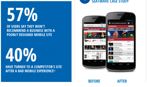
Since 50% or so of most of Google’s traffic is now coming from mobile, this has the potential to be a massive #fail if you don’t have a mobile version of your website. If it’s not fixed, less traffic from mobile will hit your site, and thus less revenue and less sales, unless you start splurging your budget on Google AdWords. Pricey!
What can you do to prevent losing money?
In a word, mobile optimize your website to suit iPhones and Android devices and do it quick. You really have before the deadline of 21 April 2015 to get your house in order. For most people in the web business, this will not be seen as a surprise as Google and others have been hinting that mobile is important to your visitors.
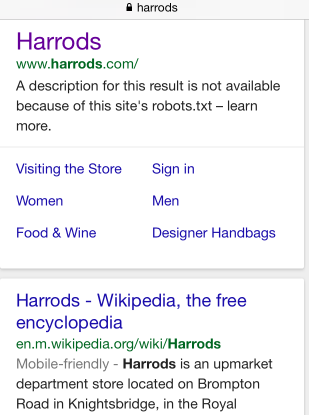
Looking at a couple of the big players:
- Tesco Direct has made their site Mobile friendly – Good Job
- Asda seems to be failing even though they have a mobile site. ( If they unblock some stuff and read the google guidance and they will be fine)
- Selfridges is ok, but Harrod’s web team should probably be sweating to get the mobile game going.
You can check your own site by going to Google’s Mobile Friendliness Test
Here’s how to fix it using Moovweb
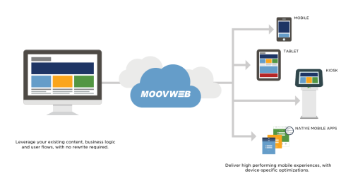 For those of you who don’t have a mobile optimized version of site, and are looking to get your website Google compliant, then you are low on time and options. The platform that I recommend that can help deliver the site with quality and in time is one called Moovweb. Doing a responsive site will take longer than a month to do and create complexity. Mobile specific sites could create nightmares from forking your code base. Other platforms make you hand over control of your code to a 3rd party. Not cool.
My experience with it
I did my developer certification in Moovweb last year as I found it to be really powerful. We have used it in a few projects at work, and I even mobile optimized my Toastmaster group’s site using the technology in a few days.
Their platform is used by large companies like Bloomingdale’s, Thomson Travel and Macy’s to deliver their mobile website so I am very confident its enterprise ready.
It’s awesome because:
It re-uses the your existing website to mobilize your pages without changing the backend. No need to keep multiple versions of the code.
- It requires less code as it re-uses the desktop code so its super quick to create projects on it.
- Its built on standard web technologies so anyone can pick it up and use it.
- You can mobilize a typical site in days or weeks instead of months.

- Moovweb are a Google second screen partners so the solution is guaranteed to be Google compliant ( as long as you do it right)
- It was created by Hampton Caitlin ( who also created the epic CSS Pre-processor, Sass) so it has all the best practice tools for mobile built in. (eg spriting, minification, Sass, etc)
Intuitive to learn and quick!
I fully mobile optimized a 7 page website for a customer in 5 days and it looked like it had been designed for mobile from day one. Customers loved it and conversion rate sky rocketed. As a by-product, they are looking forward to the April 21st date as some of their competitors are not yet mobile friendly so they are expecting a boost in their organic Google Search traffic.
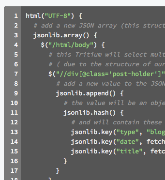
Even more amazingly, as a by-product by flicking a switch I also can output a Json Api using Moovweb for their site which we are using to build out mobile apps for them.
They plan on going big on mobile for 2015, and I look forward to seeing the results.
For more information check out Moovweb.com
If you want to talk about what I did with Moovweb or other technologies in the blog, then happy to have a chat, as I am always looking to meet people via my blog.
References:
Search Engine Watch aricle on Mobile-geddon